10 Questions With… RAMSA’s Michael Jones and Historian Andy Campbell
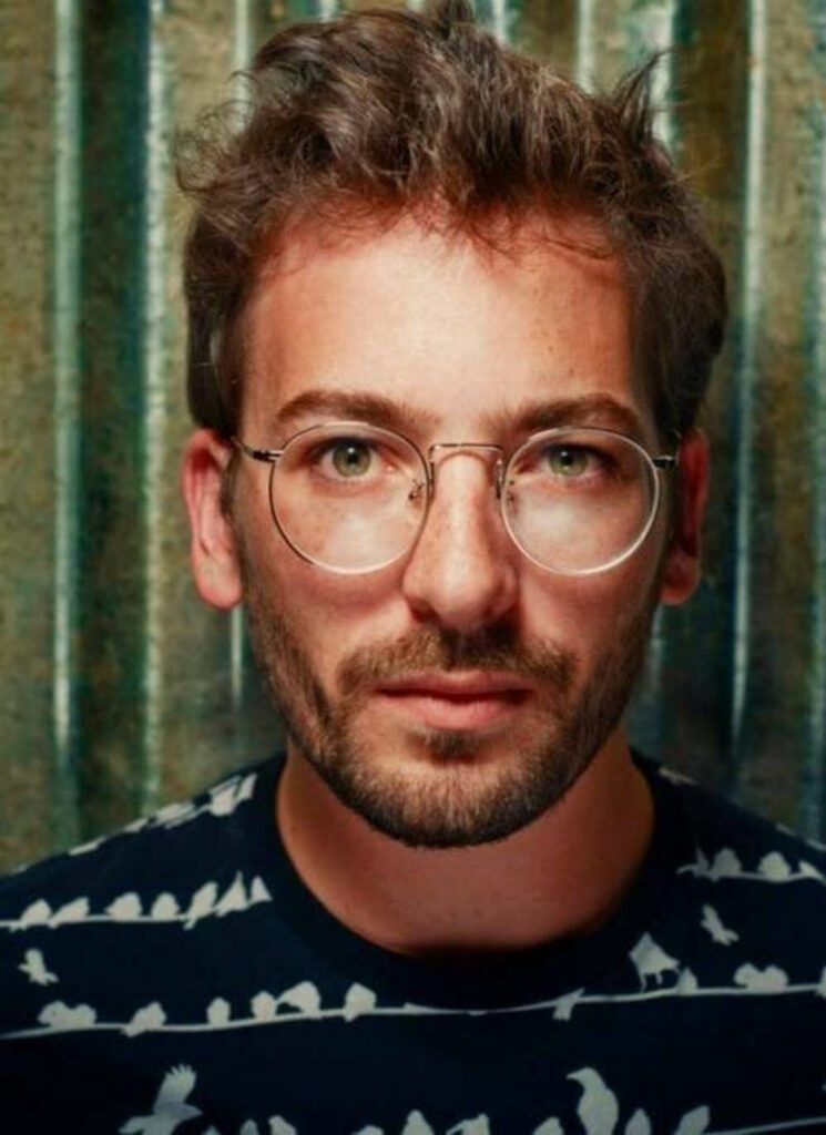
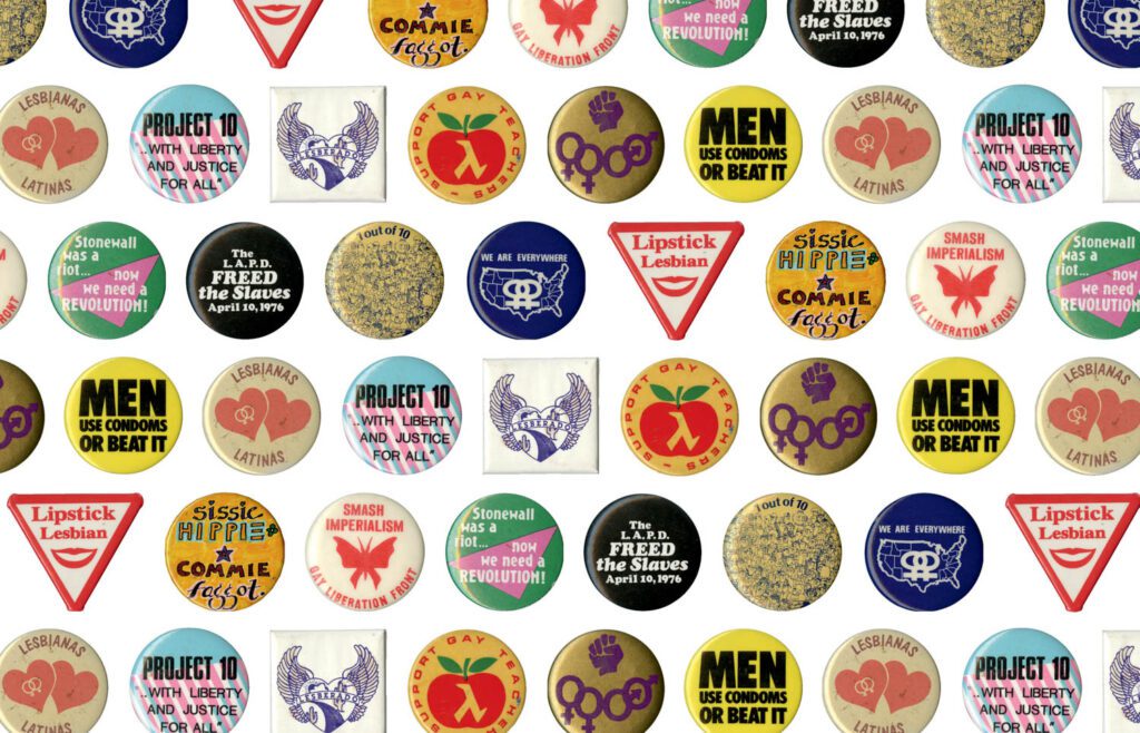
New York-based architecture firm Robert A.M. Stern Architects—also known as RAMSA—incorporates education, lectures, and exhibits into their contemporary practice. “It’s creating the culture of an architecture school within the office,” associate Leopoldo Villardi explains. Recently, RAMSA partner, Michael Jones, brought scholar, Andy Campbell, author of the recent Queer x Design book, to the office to discuss the history of queer graphic design followed by a walkthrough of an on-site exhibition.
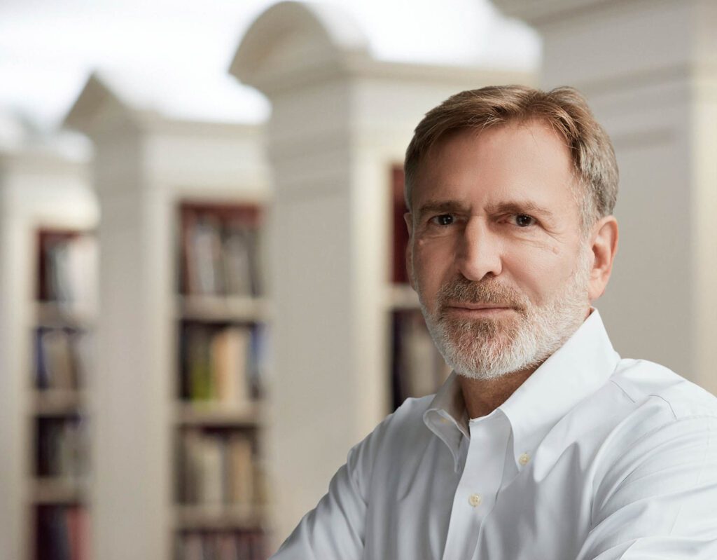
As partner at RAMSA, Jones designs and manages global projects across sector. He is also the co-founder and partner liaison of RAMSA’s Q+ Committee, which is chaired by Lok Chan. Interior Design talks with Jones and Campbell, who also authored Bound Together, about the importance of honoring the past, the “queering” of design, and their plans for the future.

Interior Design: Michael, how did you learn of Andy Campbell’s work and why did you want to bring this scholarship to RAMSA?
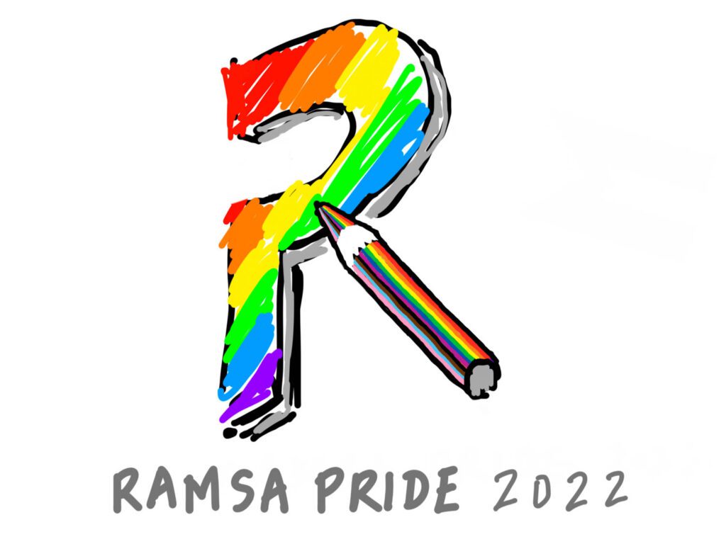
Michael Jones: Over the last two years, RAMSA Q+ (our office’s LGBTQ+ group) has held an internal competition asking staff to design a logo for the group, which we used to raise money for the Ali Forney Center. This, of course, took place during the pandemic, so naturally our winners, Jie Huang and Boyuan Zhang, digitally sketched their entries. When it came time to showcase their work, we had to ask ourselves: Should we preserve the hand-drawn character of their designs or clean them up? Which of those two options was more queer? That set us down a path researching the history of queer graphic design and graphic art, and with that came a wonderful discovery in the form of Andy Campbell’s book Queer X Design. It’s a really inspiring compendium, and I quickly came to realize how few people knew the stories behind many of symbols and visuals still around today. So, we decided to stage an exhibition on the history of queer graphics in our office—and since Andy had already done all this research for us, we thought we should invite him to give a lecture. [Laughs].
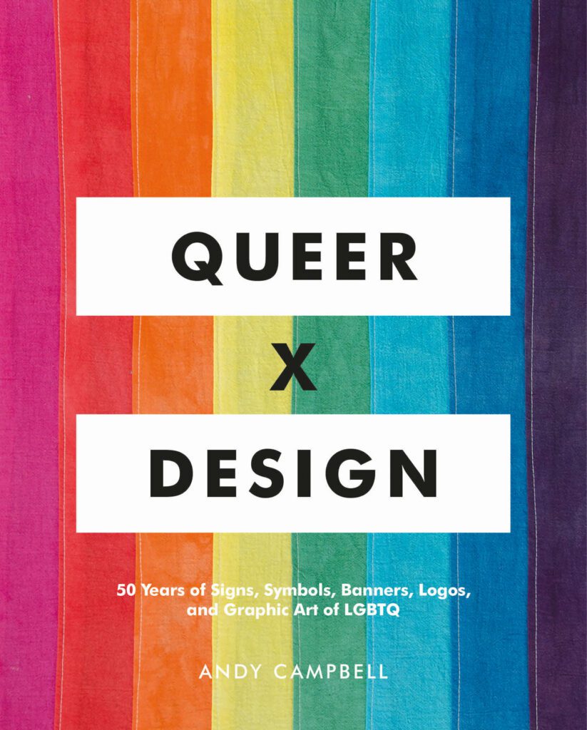

ID: Michael, which image(s) were the most inspirational to you in the book and, Andy, can you tell us a bit about their place in the history of queer design?
MJ: I knew a bit about the history of the rainbow flag and the pink triangle, but thanks to Andy’s book, I discovered this fabulous poster for The Saint, a nightclub in the East Village that was open during the 1980s. In the end, we didn’t include it in the exhibition because we thought it might be too risqué for the office setting—even though the typography covers much of the man featured on the poster, he is clearly naked—but he has rainbow lasers coming out of his eyes and fingers. It’s amazing and very much a part of 1980s culture. Even though I’d never gone to The Saint, my brother had, so I would always hear about the parties. Now, I’d love to put that poster on my living room wall.

Andy Campbell: I love that choice, Michael, for a couple reasons. The first is, of course, everything you just mentioned, which is about the piece of graphic design that is reproduced in the book. But also because of the interior and financial architecture of the venture. The Saint’s owner, Bruce Mailman, also owned the building where the refurbished St. Marks Baths was located—linking its fortune, to some degree, to that of the club. In terms of its interior, the circular dance floor the planetarium-style dome, and the balcony looking through the scrim of the dome, all of these were part of its appeal in an era where the quality of sound, lighting systems, and general atmosphere mattered a great deal. The Saint really had this formula down. We should also remember that it was also an exclusive membership-style club, so there is also another edge to that institution, and not everyone experienced the kind of pleasures offered inside.
ID: What does “queering” mean to you and how does it inform your work?
AC: “Queering” is a kind of activity—a verb of movement, mutation, assessment, and play. Its application is wide-ranging; often in academic contexts it is used as a shorthand for challenging core assumptions or restructuring dominant power relations. In that respect, queering is a utopian project to some degree. And as heady as all of that sounds, I can baseline what it means in terms of my scholarship, which is largely focused on LGBTQ+ communities in the U.S.—it means that I have to always be thinking about not just the content of my work, but also the mode of address and the necessary process of self-examination to better meet and aid the communities I claim to be a part of.
ID: One of the topics in the book is the history of the rainbow flag and the ways it was devised to draw attention to itself. Andy, can you tell us a bit about that? And Michael, how did that inspire you?
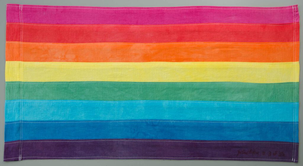
AC: The rainbow flag is fascinating because it was developed by a group of people including Gilbert Baker—who also became the rainbow flag’s chief evangelist during his lifetime—Lynn Segerblom, James McNamara, and many others. Its colorway is very much a product of its milieu in late-1970s San Francisco. Rainbows were everywhere. There was a well-known performance artist named Jon Beau Lee who performed as Rainbow the Mime. Segerblom, who was even known as the tie-dye queen of San Francisco, had her name legally changed to Faerie Argyle Rainbow. So, in one sense the rainbow flag speaks to this particular context, and in another sense the values accorded to the colors of that original flag—sex, life, healing, sunlight, nature, art/magic, serenity, and spirit—speak to the concerns of this group of makers. In the book, I remark that even in a dark room a rainbow flag remains visible. It’s a nice visual to meditate on, and it speaks to the primary political (and practical) process of coming and being ‘out.’
MJ: For a time, I was one of those baby boomers who thought the rainbow flag shouldn’t change or incorporate new colors. I suppose I felt that it should stay the way that a younger me saw it—but, as I learned from Andy, the flag has always been changing. In fact, there were two “original” flags. They were both different, and one of them went from eight, to seven, to six different colors in the first year of its existence. The flag has never been this immutable, untouchable symbol that I held it up to be—and I now see the beauty in that. Over the decades, it has continued to adapt to remain a potent symbol for an ever-expanding queer community.


ID: Andy, one of the topics you explore in the book is the way queer symbols mutate and change over the years. Michael, how do symbols and their ever-changing nature inspire your work? Or to put it differently, does architecture feel malleable to you?
AC: The pink triangle is a great example as it was initially used by the Nazi regime in Germany to identify male homosexuals. As a sidebar, lesbians were marked with a black triangle, which was attached to a wider category of “anti-social” prisoners indicating how lesbian identity was thought of as a direct challenge to patriarchy and German social order. During the first decade of the AIDS crisis, a group of designers and artists came together to resituate the pink triangle as a symbol of power, turning it onto its base and adding iconic text “SILENCE = DEATH.” That the pink triangle is now used beyond this context today, sometimes adorning clothing and the body as a tattoo is indicative of its dramatic transformation.
MJ: Well, architecture certainly operates on a much slower timescale than graphic design. But good architecture, at its core, is malleable—or at the very least accommodates malleability. Going back to the example of the ever-evolving rainbow flag, the language of architecture is constantly changing, too. When I look to history books as a means of inspiration, it’s just a jumping-off point for something new, or a time-tested idea that can be shaped for the here and now. The rainbow flag has decades of history ingrained within it; the pink triangle even more so. We’re fortunate to have many centuries of architectural thinking that can be adapted for the present as a way to give new meaning and character to buildings.
ID: You each work in different fields, but you could argue that the legacy of AIDS activism still reverberates through both. A question for both of you, does it inspire your work in any way today?
AC: Yes, I think AIDS—its ongoing present—is a defining factor in my research. It’s difficult to work on LGBTQ+ communities in the late 20th and 21st centuries without constantly considering its impact—not only in terms of who might no longer be around, but also in its hand in scripting the very language of how we relate, have sex, and understand ourselves. So, it comes up a lot, in both dramatic and everyday ways.
MJ: The AIDS pandemic certainly impacted me and the culture of our firm. In the 1990s, our office designed a showroom for the Design Industries Foundation Fighting AIDS (DIFFA). Raul Morillas, who led that effort as well as RAMSA’s interior design department, later died of AIDS. I knew many designers like him who were lost too soon. I’d like to find a way to remember them; I’ve often thought about organizing an exhibition of their work. But it’s also why I co-founded the RAMSA Q+ group—it comes down to having the right conversations, and that’s why we host lectures and put on exhibitions in our office and everything else that we do.


ID: Using research is important in both of your fields. What’s your approach to the research process and how does it inform your final outcomes?
AC: I’m a shelf-browser—a dying breed! Which is to say that when I’m researching something, it is not just the destination as I understand it but a willingness to remain open to being changed, swayed, or distracted by something I might find along the way. Queer X Design was, in some senses, a collection of these moments along other research journeys—collected items that I had no place to discuss in a given project, but which I set aside in the hopes of finding some future project for which they would be right.
MJ: Understanding context is critical to our design process; architecture should positively contribute to neighborhoods and elevate everyday life. For me, this process often begins in our office library—it’s one of the largest private architecture and design libraries in the country with over 18,000 volumes. But I also think it’s important to realize that research isn’t always so intentional—oftentimes happy accidents and other discoveries help set you down the right path. Sometimes this discovery is found in a book, sometimes it’s found walking down a new street or seeing a building detail you hadn’t noticed before.
ID: Although the book spans many decades, you both have talked about loving some of the work created in the 1970s. What draws you to that time?
AC: For me there are two answers to this question. As a period of time, it represents a moment when some of the ideas of gay liberation were really beginning to take hold—and even that is filled with contradiction, as many, many others in our communities were not experiencing this kind of freedom. It also represents a period of a kind of nationalization of gay and lesbian politics, which is interesting to coordinate with an efflorescence of gay and lesbian social spaces such as bars and community centers. The 1970s are also the most recent period that I have no direct memory of. Being born in the early 1980s, I find it fascinating to understand these social worlds from a slight remove.
MJ: It was also an interesting moment in architectural history: the debate about postmodernism was beginning in the 1970s. Interestingly enough, the architecture of that time also had a really graphic quality to it—applied supergraphics, flat architectural cut-outs, bursts of color, and so forth. And of course, the 1970s came in the wake of Stonewall.
ID: Some of the work in the book is directly confrontational. What do you see as the power of confrontation as it relates to the history of queer design, as well as the creation of physical space and architecture?
AC: Confrontation is certainly central in LGBTQ+ histories of protest and politics. Nothing is given in the political sphere without being demanded, without an investment in questioning or countering systems as they currently exist. Confrontation is one way by which we articulate a politics (personal or coalitional)—and its power is to put politesse aside in the service of doing the work so that all people can be free. It comes out in some of the most arresting pieces of graphic design—taking politicians to task on their anti-LGBTQ+ positions, refusing to quietly acquiesce to malignment and maltreatment.
MJ: Right—many in the LGBTQ+ community are accustomed to confrontation. When I was a student at the University of Virginia in the early 1980s, I didn’t feel accepted as a gay man; in fact, the fraternities rallied against us. During the AIDS pandemic, when death was essentially in your face, confrontation was a huge part of the AIDS Coalition to Unleash Power (ACT UP) marches. I found refuge and community in New York. In fact, I joined RAMSA because it seemed like a safe space—Bob Stern was constantly quoting Golden Age Hollywood actors and characters, especially Norma Desmond, in printed interviews. I thought: “How fabulous—now that’s someone I want to work for!” But it shows how even the slightest signals by allies and queer people can help create community and foster queer-friendly spaces.
ID: What are you both working on now and in the coming years?
AC: Currently I’m a resident scholar at Crystal Bridges in Bentonville, Arkansas, working on a book about the various ways poverty has circumscribed artistic practice in the U.S. I’m looking at a suite of artists—all women, all queer at the moment—whose work reveals a continual dance with the circumstances of poverty (in its many manifestations). It’s a tough project to get my arms around, so it’s slow-going, but certainly edifying work.
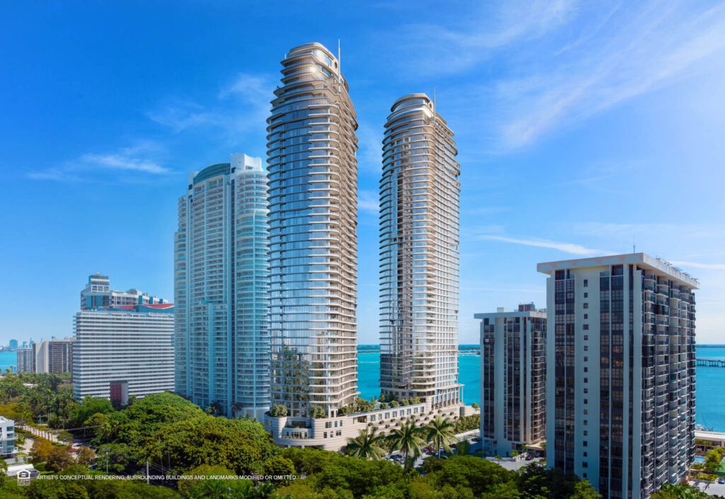
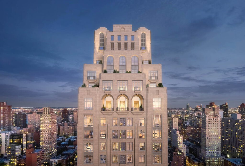
MJ: I’m fortunate to have projects here in New York City as well as around the world. In addition to a few towers in Manhattan, including 200 East 83rd Street, I’m working on a small apartment house in Hong Kong, a pair of towers in Miami’s south Brickell neighborhood, multi-family projects in Lima, Peru, and getting started on a new project in Taichung, Taiwan. Although I’m not personally involved, I’d be remiss not to mention that I’m especially excited that RAMSA partners Graham Wyatt and Preston Gumberich are working on an addition to the New-York Historical Society, which will become the future home of the American LGBTQ+ Museum.





read more
DesignWire
‘Jeffrey Gibson: Infinite Indigenous Queer Love’ Opens at deCordova Sculpture Park and Museum in Lincoln, Massachusetts
Jeffrey Gibson is master of myriad mediums. Painting, sculpture, Southeastern river cane basket weaving, Algonquian birch bark biting, porcupine quillwork. The variety reflects and draws from his diverse background: He�…
Projects
Kelly Behun’s Living Gallery Invites Viewers Near and Far to Indulge in Design
Designer Kelly Behun recently unveiled her second Living Gallery concept—a digital e-commerce space connecting viewers to the full-floor model apartment she curated at 1228 Madison in New York City.
DesignWire
See the South Beach Lifeguard Towers in a New Light in Tommy Kwak’s Book
“Lifeguard Towers: Miami” by Tommy Kwak features the colorful lifeguard towers by William Lane Architect following Hurricane Andrew in 1995.
recent stories
DesignWire
10 Questions With… Louis Durot
French artist and chemist Louis Durot talks about the evolution of his whimsical forms, his upcoming autobiography, and advice from a brief run-in with Picasso.
DesignWire
10 Questions With… Jessica Helgerson
Jessica Helgerson discusses her new lighting collection with Roll & Hill, some favorite projects, opening a Paris branch of her eponymous firm, and more.
DesignWire
10 Questions With…. Tadashi Kawamata
Get to know Japanese artist Tadashi Kawamata who created a surreal installation for the facade of French design firm Liaigre’s Paris mansion in the fall.


